Branding for Strong, Driven, Women Podcast
Branding, Content Creation, Consumer Research
The Strong, Driven, Women (SDW) podcast aims to empower women to navigate the delicate balance of parenthood and self-fulfillment, debunking the myth of doing it all, while providing a platform to connect with and learn from successful women for networking and business growth.
For my first freelancing project, I was tasked to create a branding toolkit for SDW. As the podcast is still in production, I conducted interviews with the creator to gain a better understanding of the brand she imagined as well as the audience she was targeting. From there, I did a deep dive into the entirety of the brand's competitors, worked with her to find her brand's tone and voice to help define the visual expectations, and determined her target audience through her content pillars.
From my findings, I found the brand's content pillars to dive deep into managing professional responsibilities with family life; leadership and entrepreneurship insights; and, navigating through cultural differences while shaping a professional life. Researching similar podcasts geared towards successful women like Michelle Obama's podcast, SDW's voice and tone should inspire listeners by insightful conversations and uplifting thoughts from successful women, with communication being warm, casual, and reflective.
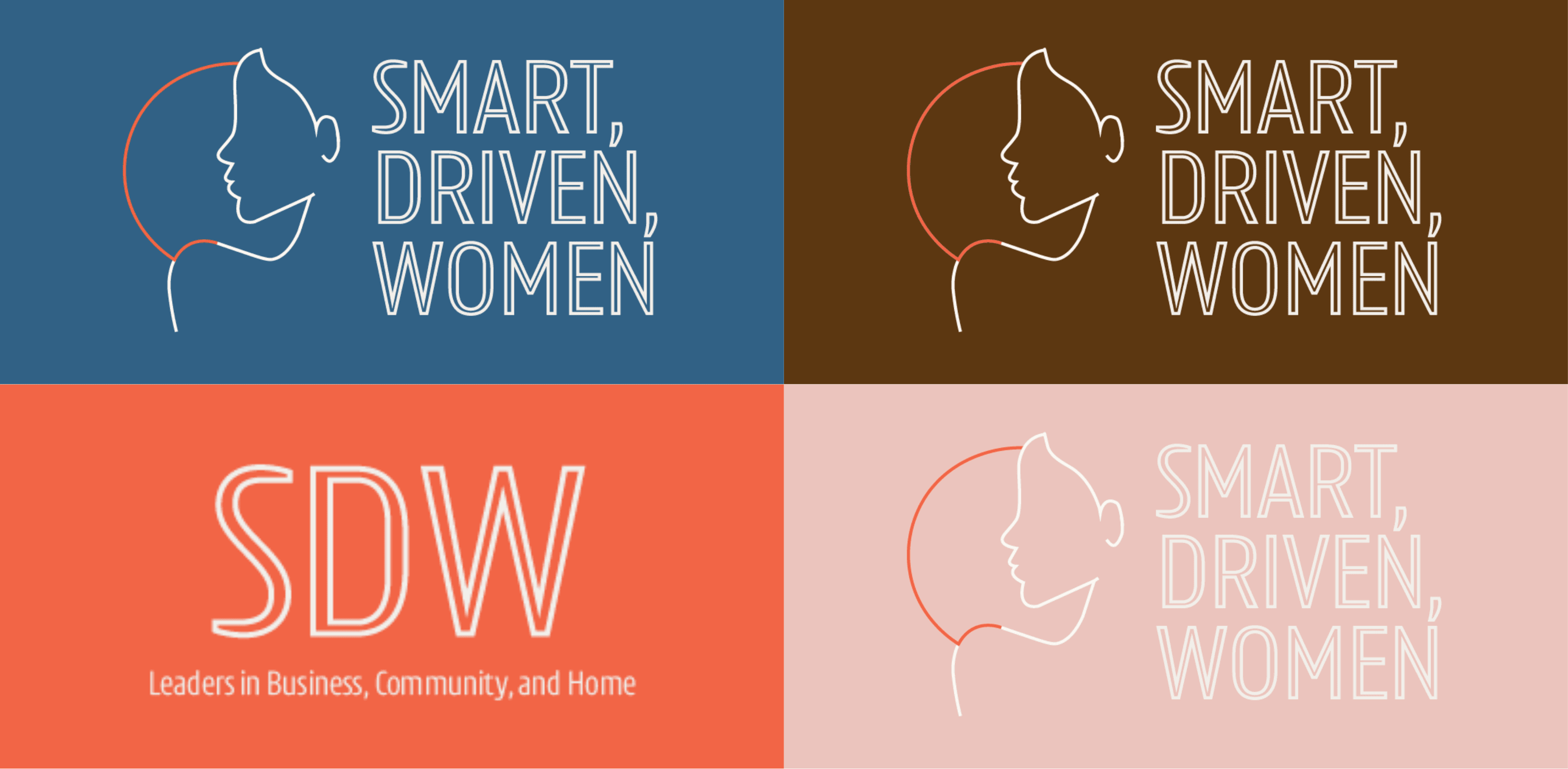
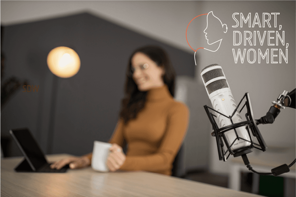
Taking note of the insights gained from research, I designed a logo that was minimal, modern, and elegant with a logomark that symbolizes how women can do it all through an outline of a woman and a round circle behind her to represent a full day as well as a logotype in a bold, modern sans serif. After two rounds of iteration working with the client, we agreed on using blue and ivory for our primary colors, playfully contrasted by a lineup of cool and mellow tones that make up our supporting colors to add warmth and life to her content. In addition, the selected font choice embodies professionalism and timelessness with legible and distinct characters. Overall, we aim to give our audience a pleasant reading experience through substantial and inviting content presented in its best form.
As a result…